


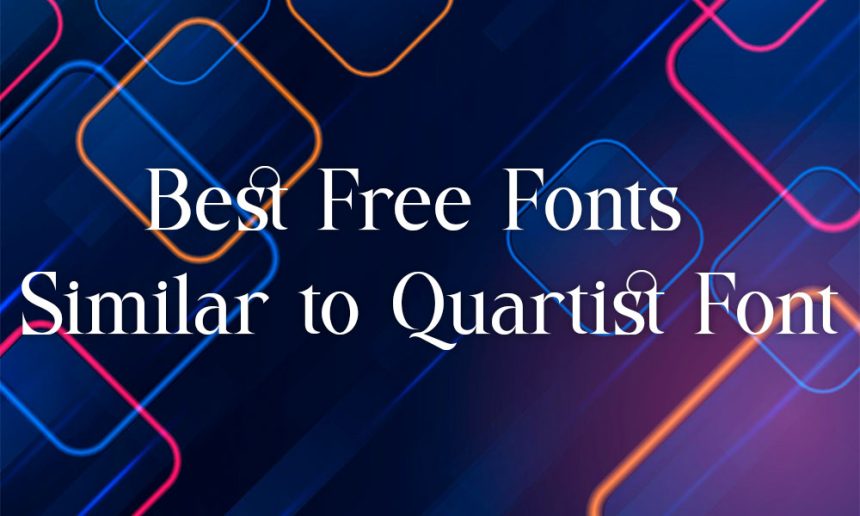
Choosing the right font can completely transform a design project. Whether you are building a luxury brand, creating social media graphics, or designing a modern website, typography plays a huge role in visual appeal. Many creatives are drawn to the Quartist font for its refined serif styling and upscale visual character that instantly adds sophistication to designs. However, not everyone wants to spend money on premium typefaces or deal with complicated licensing rules.
That is why many creatives now search for free fonts similar to Quartist that still provide a classy and professional look. The good news is that several high-quality free serif fonts offer the same elegant aesthetic while remaining budget-friendly.
Why Designers Like the Quartist Font Style
Quartist has become popular because it combines modern elegance with classic serif typography. The font feels luxurious without looking overly decorative, which makes it suitable for many creative industries.
Designers often use Quartist-style fonts for:


- Luxury branding
- Fashion websites
- Beauty packaging
- Editorial layouts
- Wedding invitations
- Social media graphics
- Boutique logos
The growing popularity of elegant serif fonts shows that minimal yet sophisticated typography continues to dominate modern design trends.
Another reason designers love this style is versatility. Fonts similar to Quartist can work equally well in digital and print projects. From magazine covers to Instagram branding, these typefaces create a polished and premium feel.
1. Playfair Display
Playfair Display is one of the best free fonts similar to Quartist. It has a refined serif design with strong contrast between thick and thin lines, giving it a stylish editorial appearance.
Why Designers Choose Playfair Display
This font has remained popular for years because it looks modern while still feeling timeless. Many luxury brands use similar typography styles to create an upscale identity.
Key advantages include:
- Elegant serif styling
- Excellent readability
- Free availability on Google Fonts
- Strong visual impact for headings
- Perfect for branding projects
Best Uses for Playfair Display
Playfair Display works especially well for projects that require a clean and fashionable appearance.
Common use cases include:
- Website headers
- Beauty brand logos
- Pinterest graphics
- Fashion blog titles
- Editorial magazines
Designers often combine this typeface with clean sans-serif fonts such as Montserrat or Open Sans to achieve a more polished and visually balanced design.
2. Cormorant Garamond
Cormorant Garamond is another excellent alternative for designers searching for fonts similar to Quartist. It combines artistic curves with elegant serif details, making it ideal for luxury-style branding.
Unlike some serif fonts that feel too traditional, Cormorant Garamond maintains a modern and creative personality.
Features of Cormorant Garamond
This font stands out because of its stylish structure and refined letterforms.
Important features include:
- Thin and elegant strokes
- Multiple font weights
- High-end editorial appearance
- Artistic typography style
- Professional readability
Best Projects for This Font
Cormorant Garamond performs beautifully in premium branding projects where elegance matters most.
It works particularly well for:
- Wedding branding
- Luxury packaging
- Photography portfolios
- Jewelry businesses
- Boutique product labels
The font creates a sophisticated atmosphere without feeling overly complicated.
3. EB Garamond
EB Garamond is inspired by classic European typography, but it still works perfectly in modern digital design. It offers a clean and professional appearance that feels both timeless and elegant.

Although it looks slightly more traditional than Quartist, many designers still choose it for upscale projects.
Why EB Garamond Is Popular
This typeface is highly readable while still maintaining a luxury-inspired appearance.
Major benefits include:
- Professional serif design
- Excellent readability
- Clean typography structure
- Ideal for long-form content
- Great performance on websites
Best Ways to Use EB Garamond
Designers often use this font in projects that require sophistication and clarity.
Popular uses include:
- Online magazines
- Book covers
- Article headings
- Personal branding
- Editorial websites
Its balanced design makes it suitable for both headlines and body text.
4. Prata
Prata is one of the most stylish free serif fonts available today. It offers bold personality while still maintaining a refined and elegant look.
Designers who want a premium visual identity often choose Prata because of its luxurious letterforms and modern spacing.
What Makes Prata Unique
Prata creates a strong visual impact without looking overly decorative.
Some standout features are:
- Elegant uppercase styling
- Minimalist luxury feel
- Stylish serif details
- Excellent spacing
- Strong branding potential
Best Design Uses
Prata works especially well in modern branding projects.
It is commonly used for:
- Fashion branding
- Beauty packaging
- Luxury websites
- Instagram quotes
- Creative portfolios
When paired with clean layouts, this font can instantly improve the overall appearance of a design.
5. Libre Baskerville
Libre Baskerville is simpler than some other Quartist alternatives, but it still offers an elegant and trustworthy appearance. It blends classic typography with modern readability, making it highly practical.
Advantages of Libre Baskerville
This font is popular because it works well in both print and digital environments.
Key strengths include:
- Clean serif structure
- Easy readability
- Professional appearance
- Free commercial usage
- Excellent website compatibility
Recommended Applications
Libre Baskerville performs well in projects where readability and sophistication are equally important.
Best uses include:
- Blog websites
- Business branding
- Professional portfolios
- Online publications
- Website body text
The font may appear understated, but its simplicity is actually one of its greatest strengths.
6. Cinzel
Cinzel is inspired by classical Roman typography, but modern designers frequently use it for luxury branding and premium visual identities. Its dramatic appearance makes it ideal for bold creative projects.
Why Designers Like Cinzel
Cinzel creates a powerful and stylish atmosphere that feels expensive and refined.
Its main features include:
- Bold uppercase letters
- Elegant serif details
- Luxury-inspired typography
- Strong visual presence
- Free accessibility
Best Projects for Cinzel
This font is especially effective in high-end branding work.
Popular applications include:
- Jewelry logos
- Luxury invitations
- Boutique branding
- Movie posters
- Premium packaging
Although it has a more dramatic style than Quartist, it still delivers a sophisticated visual effect.
How to Choose the Right Quartist Alternative
Not every serif font works for every project. Designers should select typefaces based on their audience, brand personality, and design goals.
Important Things to Consider
Before choosing a font, pay attention to:
- Readability
- Font spacing
- Brand identity
- Digital compatibility
- Font pairing options
For example, fashion brands may prefer dramatic typography like Cinzel, while professional websites may work better with Libre Baskerville.
A carefully selected font can strengthen brand identity while also making content more appealing and comfortable to read.
Why Luxury Serif Fonts Are Trending
Elegant serif fonts have become extremely popular in modern branding because they create a sense of sophistication and professionalism.
Today, many businesses use serif typography to appear more premium and trustworthy.
Industries using luxury serif fonts include:
- Fashion
- Beauty
- Interior design
- Jewelry
- Lifestyle blogging
- Wedding services
Fonts similar to Quartist fit perfectly into these industries because they combine classic elegance with modern simplicity.
Final Thoughts
Finding free fonts similar to Quartist is much easier today than it was a few years ago. Designers now have access to many high-quality serif fonts that deliver a premium appearance without requiring expensive licenses.
Fonts like Playfair Display, Cormorant Garamond, Prata, and Cinzel can help designers create elegant branding projects while staying within budget. Each font offers its own personality, making it important to choose the one that best matches your design goals.
Whether you are building a luxury website, designing social media graphics, or creating a fashion brand identity, the right serif font can make a huge difference. By selecting the right Quartist alternative and using it properly, designers can achieve a polished and professional look without spending extra money.